
Melt Fest
In collaboration with Rachel Munroe Natassia Silva
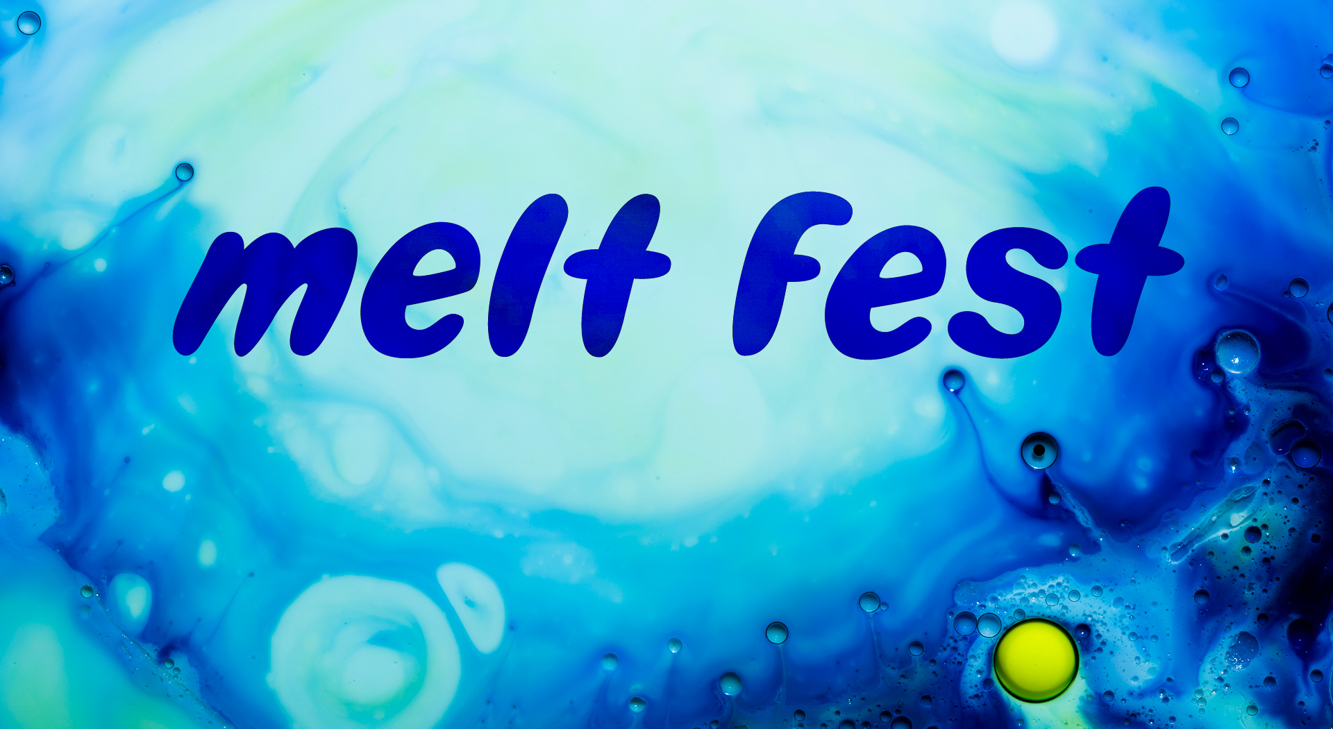
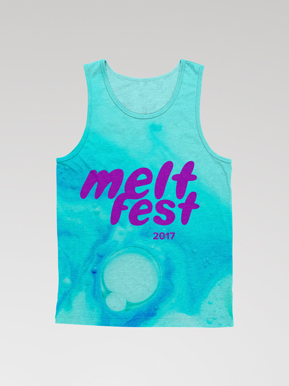
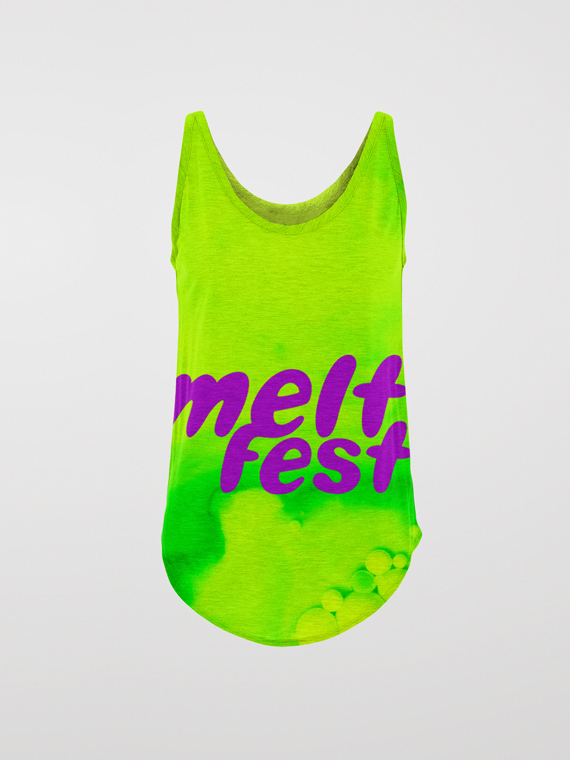
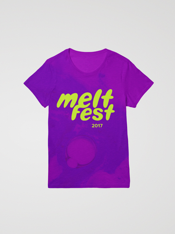
Melt is a full sensory electronic music & arts experience. It’s a party for every palate, packed with musicians pushing the bounds of electronic music. The rebrand of What the Festival captures the event’s energy through a short-lived promotional campaign.
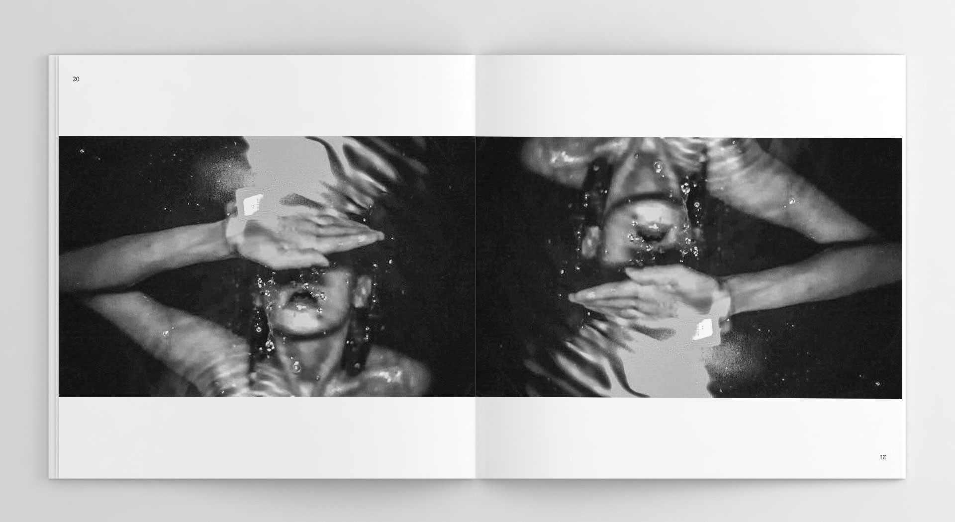
The concept, research, and brand formation (including the logo) was a thorough and collaborative process. We worked closely with photographer Mary Dee Mateo to rightly capture a look and feel that energizes the senses and is evocative of a summer camp for adults.
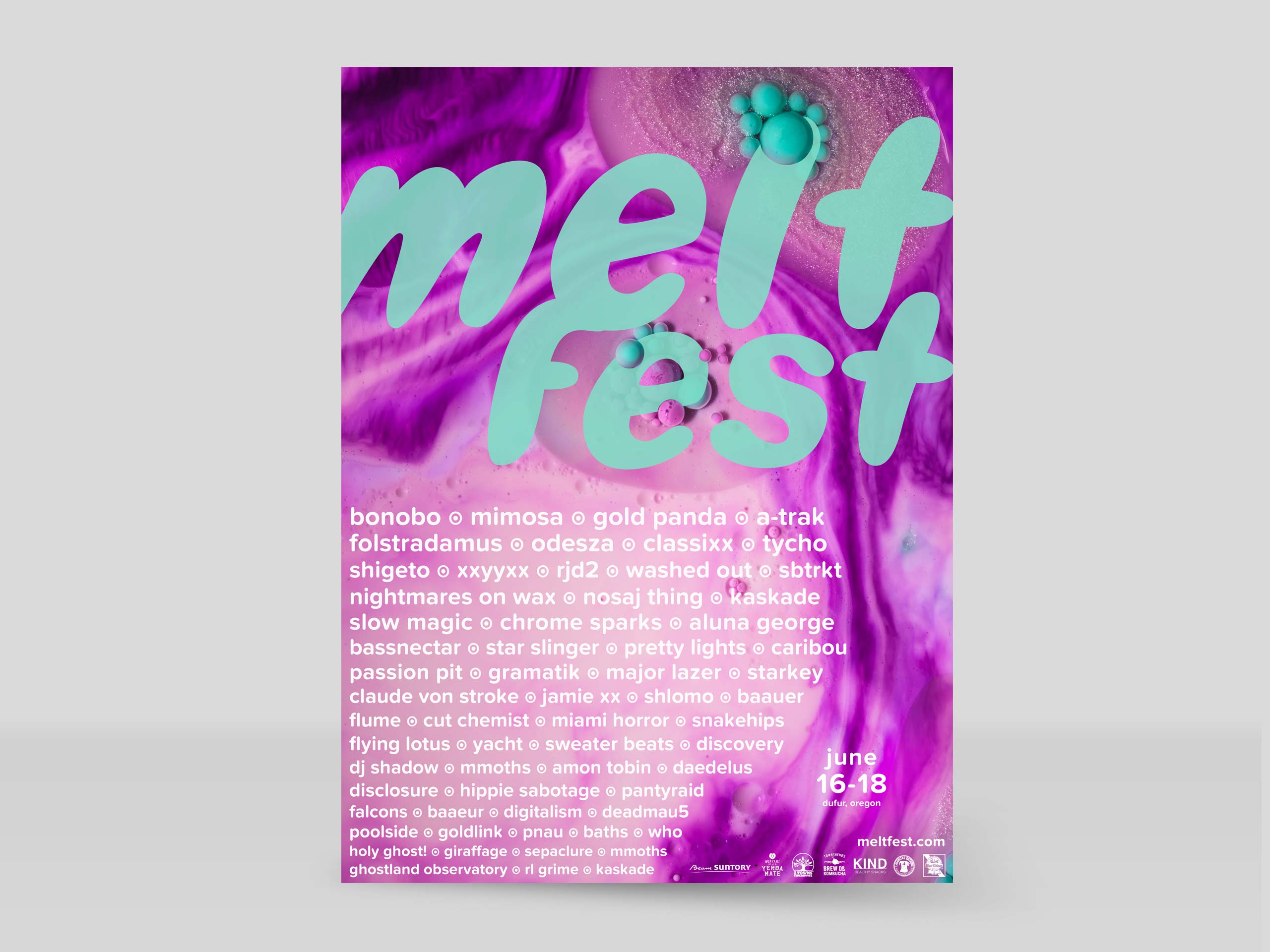
Moving forward independently with the brand expression and implementation, I worked to bring all of the organic elements together to communicate the playful, immersive experience of the festival.
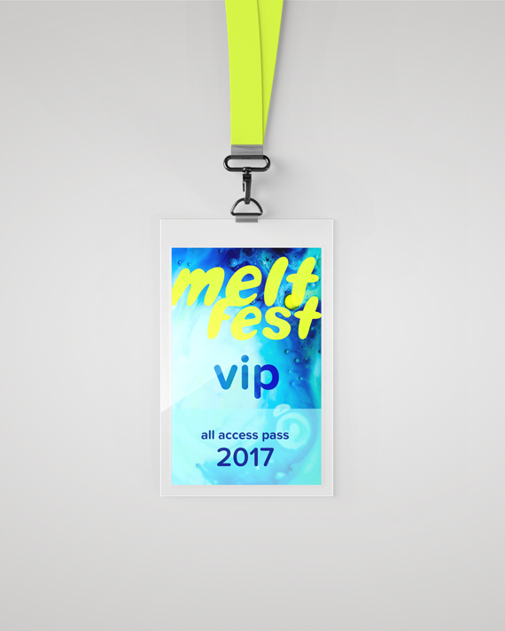
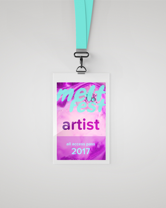
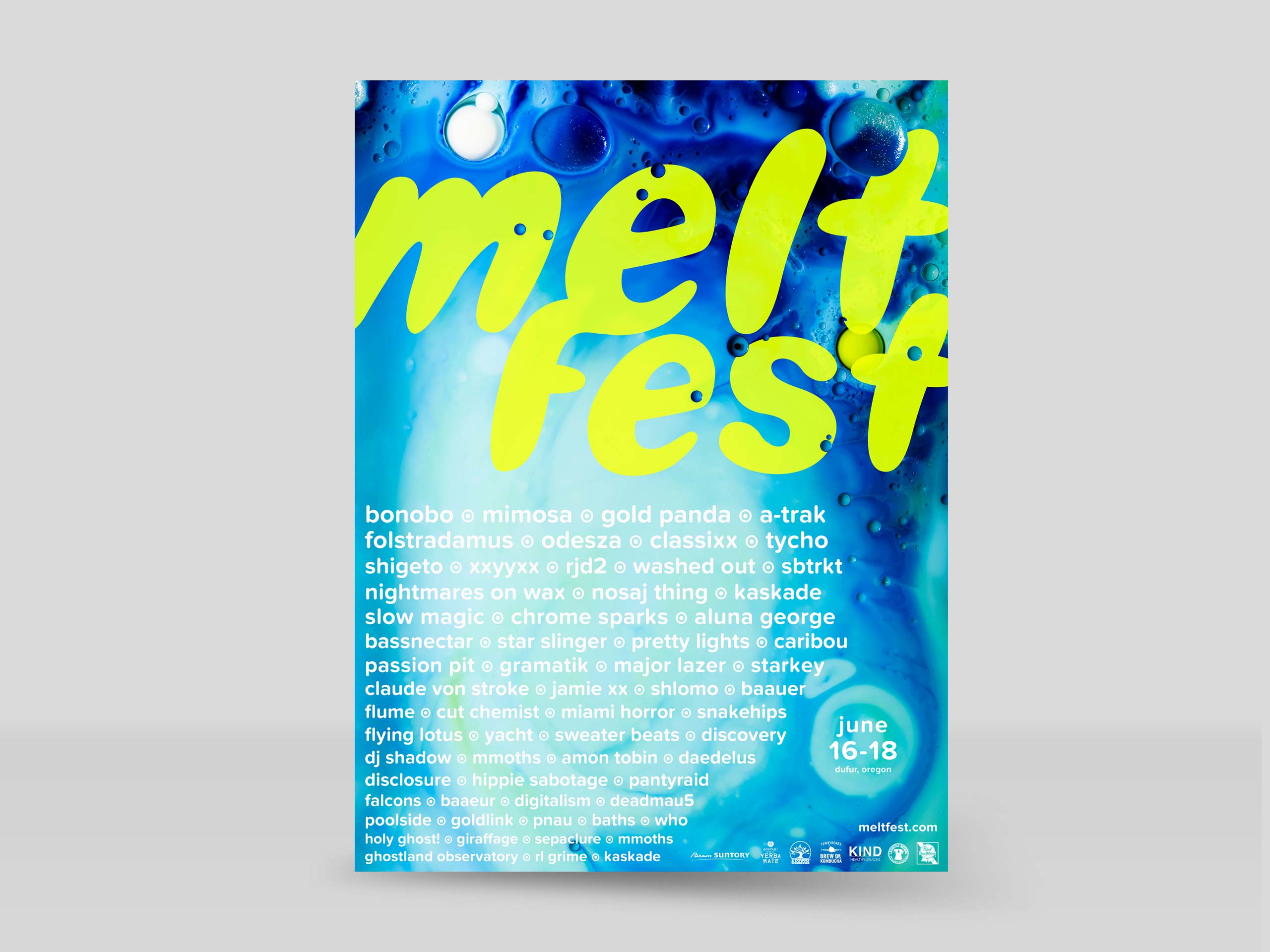
A transitory, promotional brand needs to be pliable, visually strong, and memorable. I used a rich, assorted color palette along with Proxima Nova Soft as the main typeface because of its rounded, geometric qualities that complement the bubbly, hand-lettered wordmark.
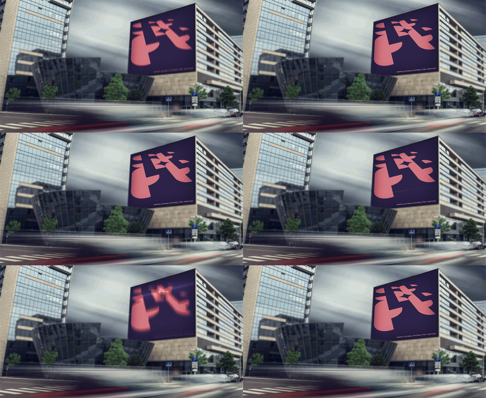
Movement is a key component of the brand’s engaging character. The young and visually inclined demographic require a captivating campaign that primarily lives on the web. The lineup release is a teaser video, meant to live in a social media environment.
