
In Praise of Shadows Book Redesign

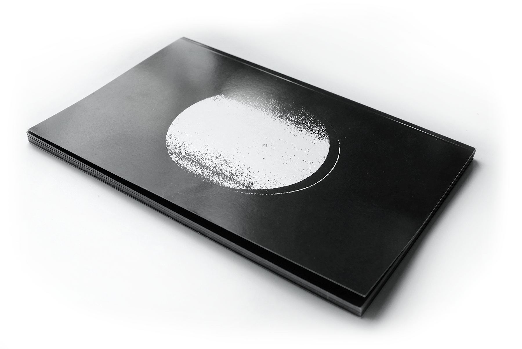
In Praise of Shadows is an essay written by author Jun’ichirō Tanizaki. Tanizaki uses comparisons of lightness and darkness to show the contrast between Western and Eastern culture. This book redesign seeks to represent my general thoughts and feelings after reading this book.
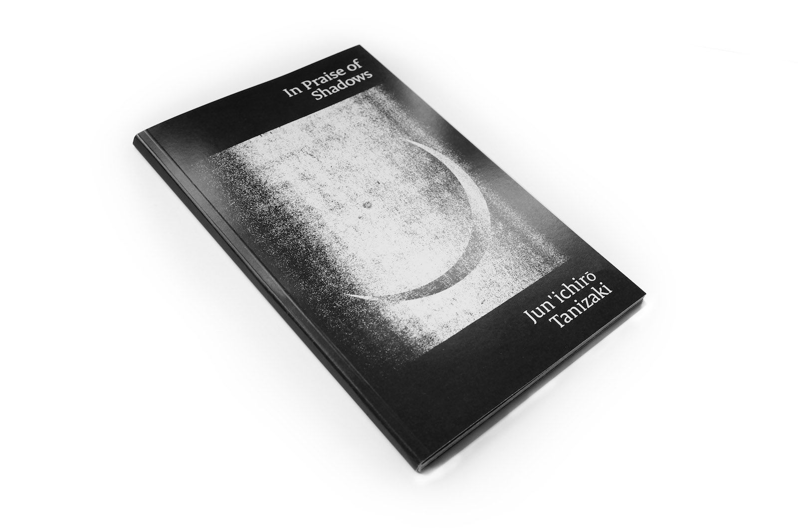
“A luster here would destroy the soft fragile beauty of the feeble light.” This short excerpt captures the essence of this book and with this cover I was trying to achieve the same conflicting feelings we have with the shadows and darkness.
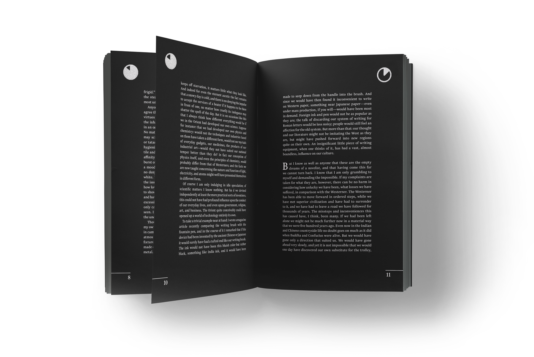
This book is a short read at only 45 pages. I felt very strongly about using white on black, it added a uniqueness about it I felt the book deserved. By doing this it slows the reader down enough to let the words sink in.
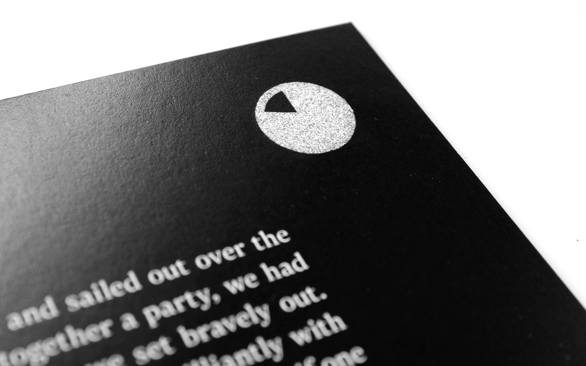
When creating the pagination for the book I wanted more than just a page number, the idea of a sundial felt like it would lend itself well to a book about shadows. I used the sundial to mark up to the completion of the book.
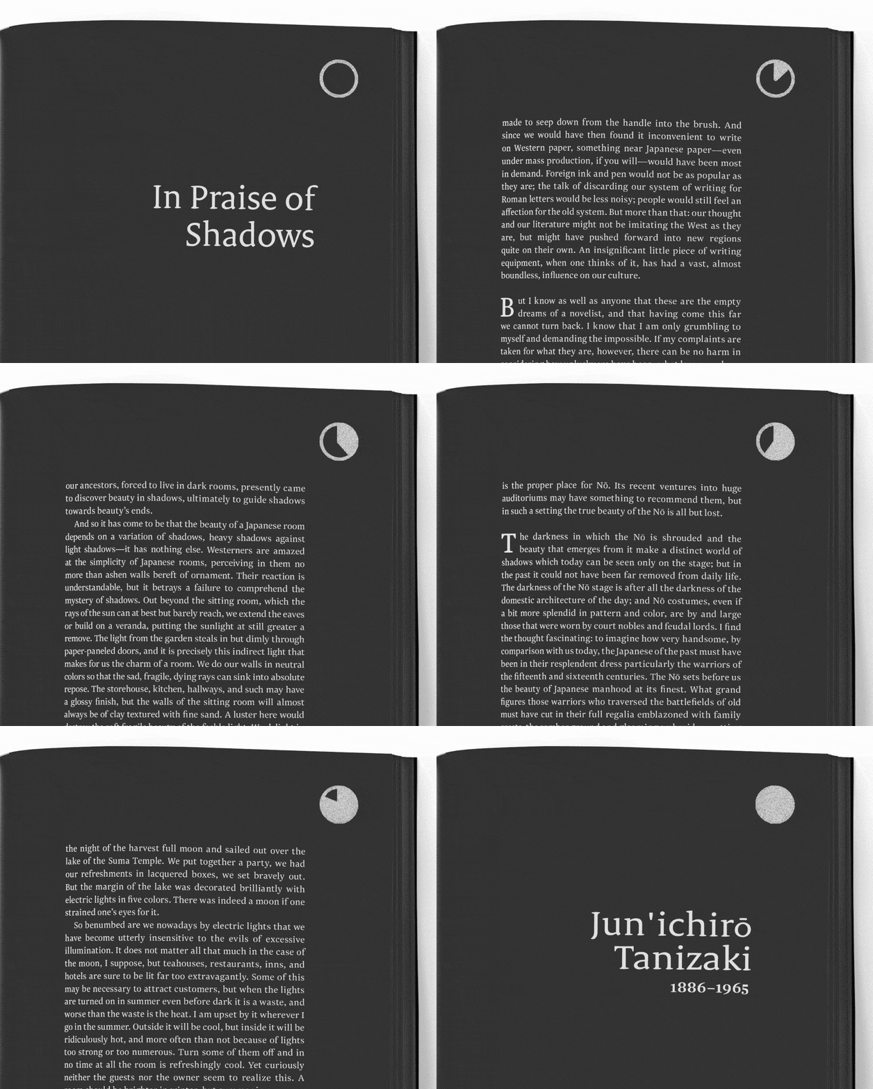
With each turn of the page the sundial continues to turn – representing time and shadows.
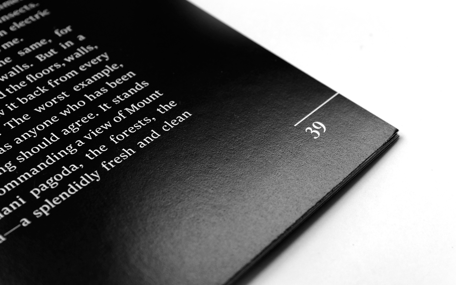
I wanted the typography to reflect the simple and matter of fact way Tanizaki wrote. I chose a clean and strong serif font to set the mood for the reader.

“And of silver and copperware: we love them for the burnish and patina, which they consider unclean, unsanitary, and polish to a glittering brilliance.”
